Introduction & Summary
FlyUX was a practice project done as part of UX Design Institute's certification in UX Design course. The project involved user research, analysis and mobile design.
Business Problem
A fictional airline - FlyUX has asked me to design a flight booking process for their upcoming mobile application. My task was to apply the full - evidence based design process to create the design for the mobile app.
Users
After conducting competitor analysis, interviews and online survey, I discovered that the most common type of users for mobile airline applications in Finland could be defined as:
1. Frequent business travelers. They often travel regionally between different company sites around European countries. They book airline tickets very often and therefore like the experience to be as quick as possible. They are somewhat price sensitive, but more important are the times of the flights (usually looking for early outgoing and evening return flight). People booking flights via mobile apps are typically in 25-40 year age range and familiar with other similar mobile applications (other airline apps, flight aggregators, hotel apps, Airbnb...)
2. Holiday travelers. They usually use different apps at the same time period to compare routes and prices and hunt for deals. They are very price sensitive and time of flight does not matter as much. They often prefer to use flight aggregator apps, but like to use airline specific apps when hunting for special offers and destination ideas.
Solution
During research and testing, two main themes stood out:
1. Users appreciate and desire the sense of control while booking the flight. In successful products, that is achieved by providing easy access to relevant information throughout the journey (for example by allowing user to easily compare flight prices on different days of the week or by providing a cost summary throughout the booking process).
2. Flight booking is a relatively stressful process therefore users appreciated non-cluttered apps that clearly communicated what they need to do and what is happening. Bugs and errors during app usage had a big negative impact on users experience and the most common compliments to successful apps were related to clean and simple UI and quick booking process.
Therefore the solution was a visually minimalistic application, presenting most important information in a bold and clear way and providing a user a sense of control by clearly communicating the task on hand and giving the user access to relevant information at all times.
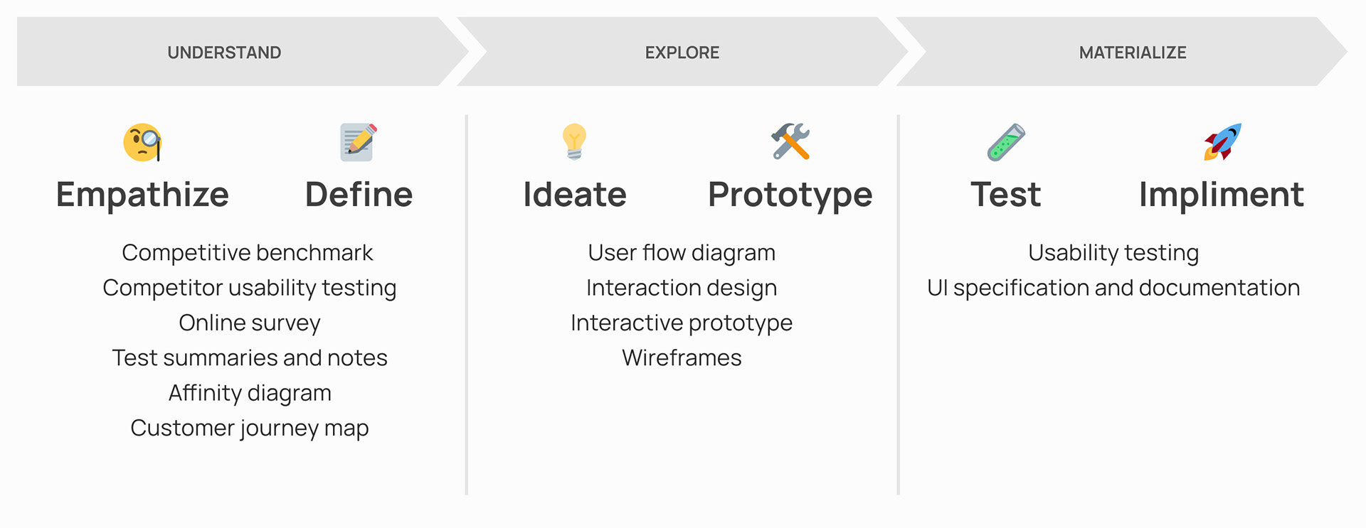
1. Understand
Competitive benchmark
Designing an application from scratch is hard and no service is built in a vacuum. The first thing I did was performing a competitor analysis to learn more about the industry. I tested 8 airline and booking aggregator apps and chose 4 (Ryanair, Finnair, Wizz and Airbnb) for an in-depth heuristic analysis.
I discovered a mixed bag of apps on offer with some doing a good job of catering to mobile users and others clearly prioritizing other channels to facilitate the flight booking process. This exercise helped me understand the market and the industry standards.
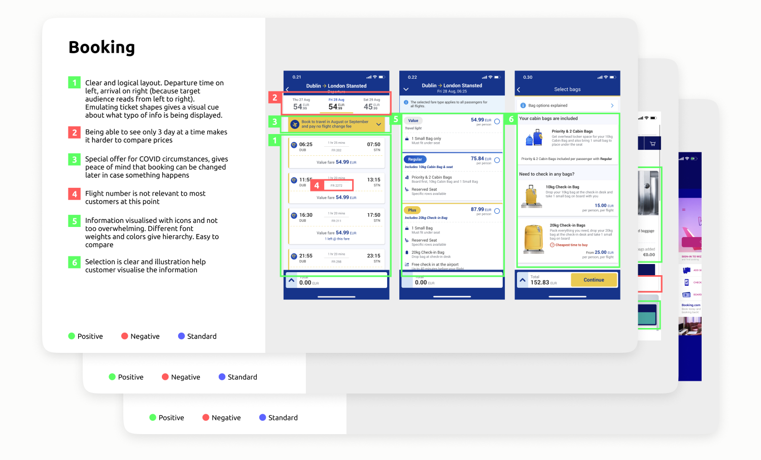
See full presentation (opens in a new tab)
Online survey
In order to build a broad insight of airline app users, I surveyed 20 respondents using an online questionnaire. The target group was people age 20-40 who used a mobile app when booking or checking in to a flight at least once. The questionnaire contained a mix of multiple choice and open-ended questions in order to glean both qualitative and quantitative information. Some themes that emerged from the survey were:
1. Airline applications are often used to check out flight price, but not to book the flight.
2. Speed achieving tasks, clear visual interface and easy way to compare prices were top quoted positives of other airline apps.
3. Conversely, among top things users would want to see more of in the apps they use were simpler interactions (less unnecessary features and ads), more clarity and transparency in communicating price comparisons between flights and price changes.
4. In the surveyed geographical area (Helsinki, Finland) most popular airline apps are Finnair, Norwegian and Lufthansa.
Usability test
In order to learn more about users experience when booking flights, I conducted a usability test session focusing on the flight booking task on two most popular airline apps in Finland (Finnair and Norwegian). The goal of this task was to gain a better understanding of how users interact with competitor products and to learn about the best practices and pain points.
The test helped me understand users desire for clarity and simplicity when booking a flight. User desires to be kept up to date along every step of the process. Any inconsistencies when navigating backwards and forwards between views were a big source of confusion and anxiety.
Affinity Diagram
After the research phase I was left with a large amount of raw data in the form online survey summaries, competitive analysis slides, and test recordings. I needed a way to condense and summarize the data into a more concise and insightful format. I performed an affinity diagram workshop with another UX designer in order to achieve this. Several themes emerged after the analysis.
1. Users crave for simplicity and speed when opening the app for the first time.
2. Users like to keep track of the price during the booking process and like to easily compare prices when choosing flights.
3. Users appreciate quality of life details such as list view and search when looking for inbound/outbound flights. Clunky and slow apps decreased trust and made people nervous.
4. During flight selection process users want to feel the sense of control and have relevant information on hand.
5. Users tolerate extra content such as hotel and car booking offers as long as it's not overwhelming and relevant, but value is dubious.
6. Users are careful when sharing personal and financial information.
7. Users notice and appreciate clean and simple apps. Informational hierarchy and is important to them.
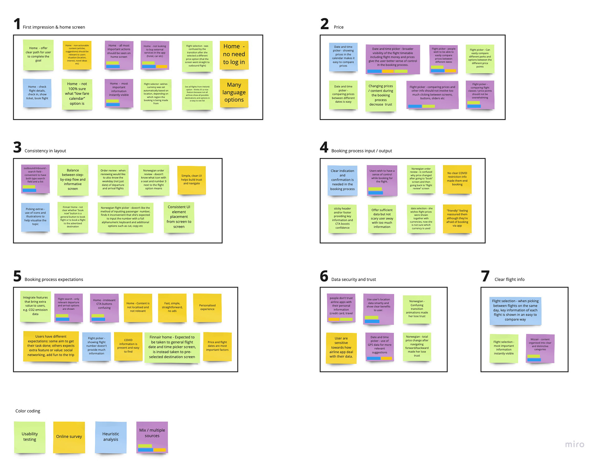
See zoomable version in Miro (opens in a new tab)
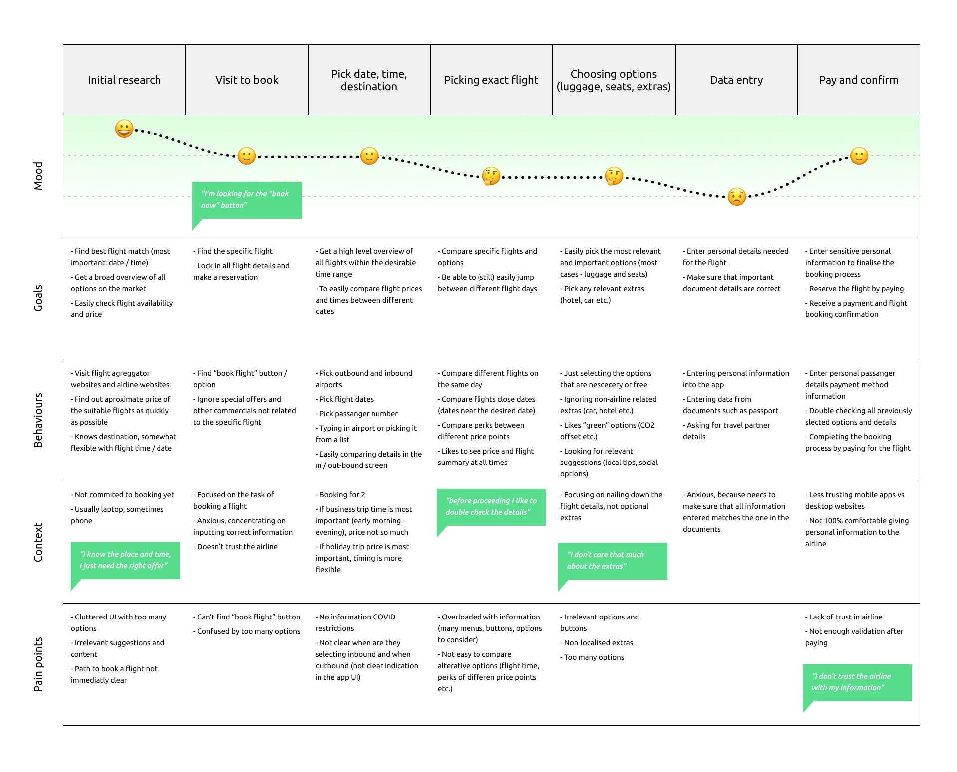
Customer Journey Map
Next my goal was to put the data into a story of a users journey through the interaction with the company. I mapped the flight booking experience from the moment the customer undertakes initial research to paying for the ticket. I defined unique stages in the user's experience and marked down notes for users goals, behaviors, context, pain points as well as general sentiment at each stage.
The map helped structure the data and tell a story which helped me and other stakeholders to understand the user at every point of their interaction with the service.
2. Explore
User Flow Diagram
First step in designing the booking process was to create a user flow diagram. I mapped every step the user would take in the application in order to achieve the task of booking a ticket. Using a simple diagram allowed me to focus on the experience and not focus on the interface for the time being. In further design steps the diagram could be used as reference when designing the app.
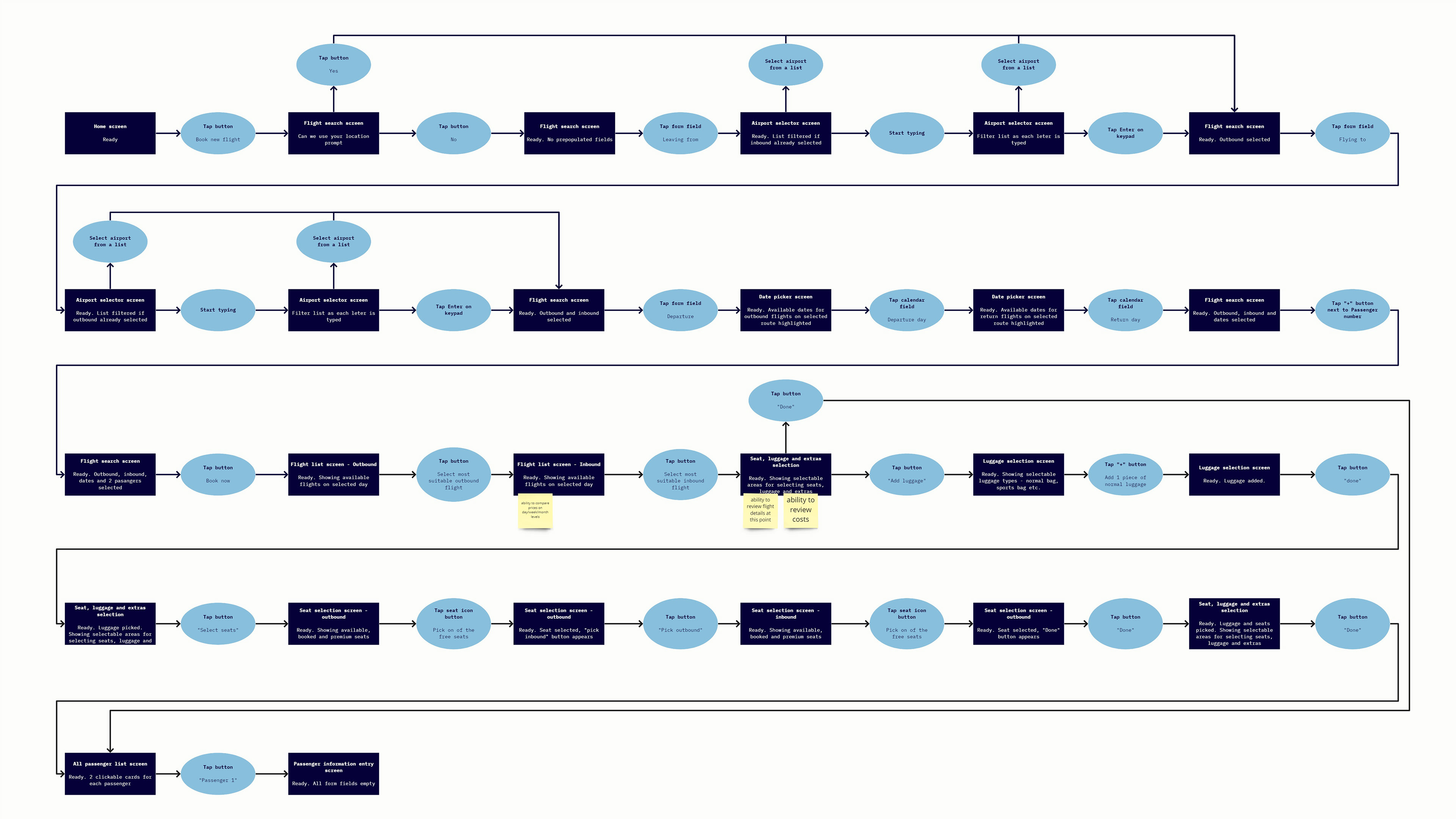
See zoomable version in Miro (opens in a new tab)
Sketching
Using the flow diagram as a reference I sketched out low fidelity wireframes with pen and paper in order to be able to quickly and freely explore and iterate different ideas and layouts. I converted the steps outlined in the flow diagram to a rough draft of UI designs.
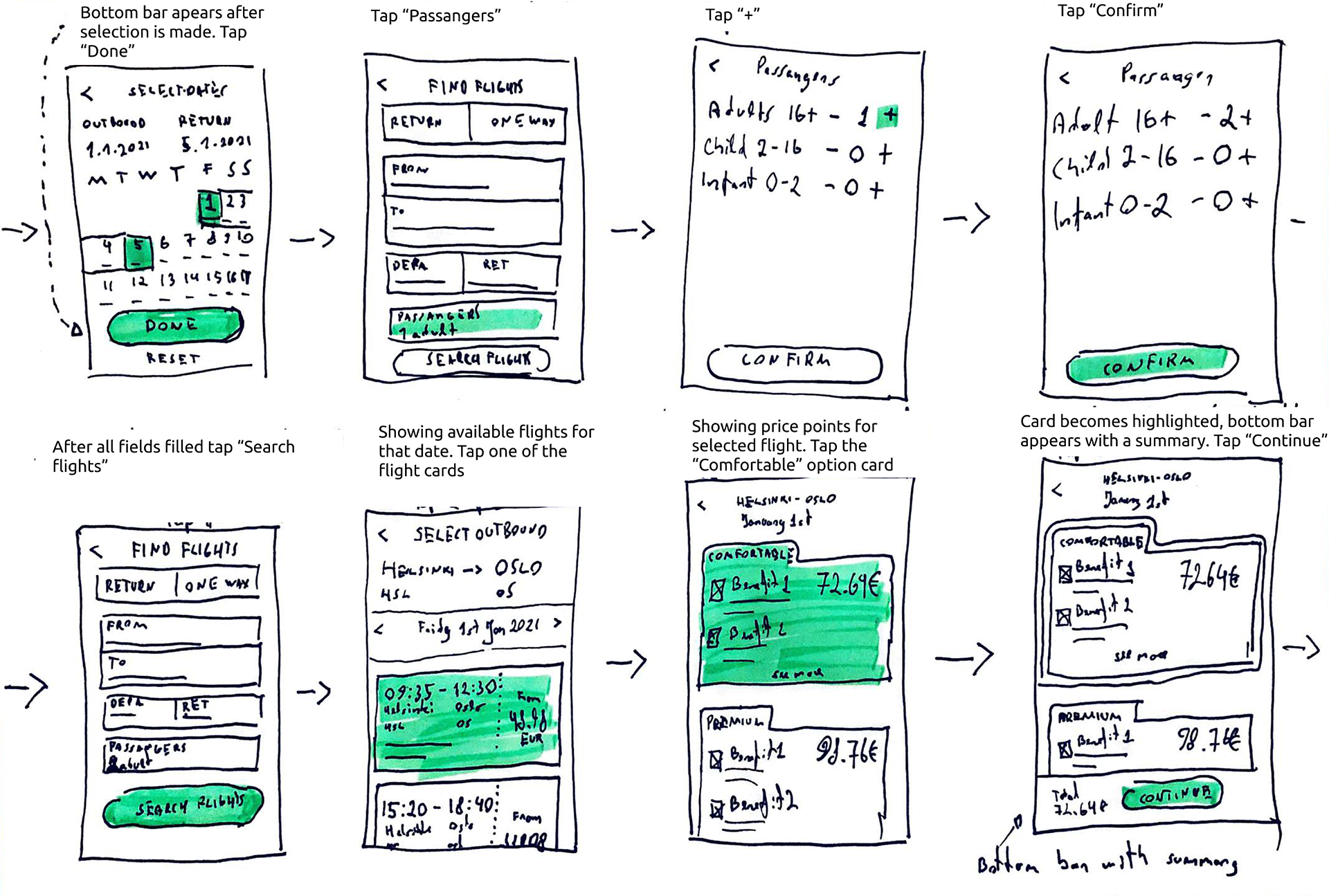
See full document (opens in a new tab)
Prototype
After creating the simple sketches of the app-to-be, the ideas could be further developed and tested with stakeholders and users. At this point I wanted to test the core of the user experience - how users interact with the views and if the information shown makes sense. In order to work as efficiently as possible I created a medium fidelity prototype. The prototype could be used for usability testing and stakeholder communication.
Open interactive prototype in Figma (opens in a new tab)
3. Implement
UI Specification
Before the project moves on to Visual Design a comprehensive and carefully considered documentation is needed that describes the required behavior of every element. The document can be used by developers, designers and other stakeholders as a reference and source of truth.
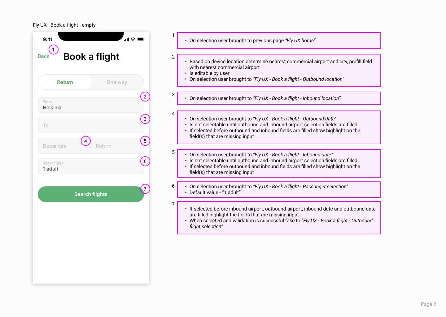
See full document in Figma (opens in a new tab)
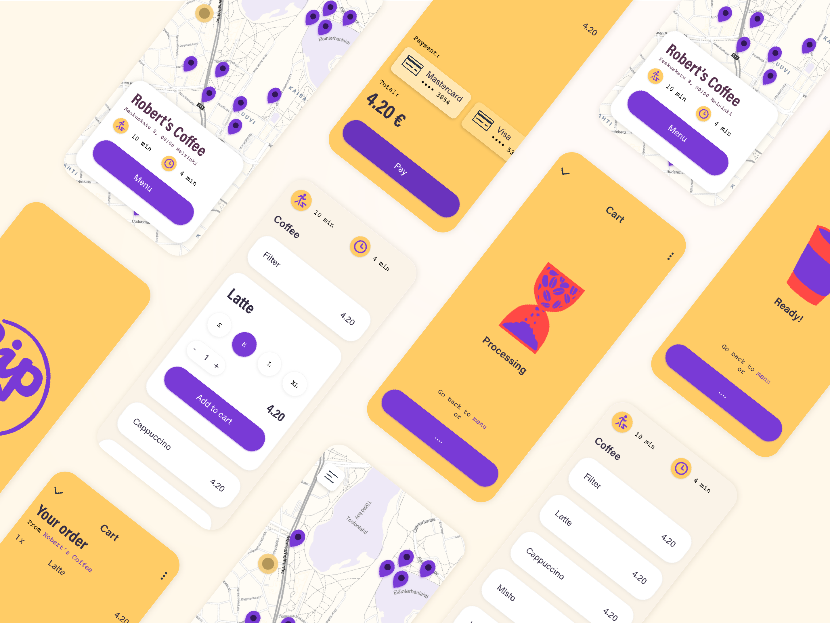
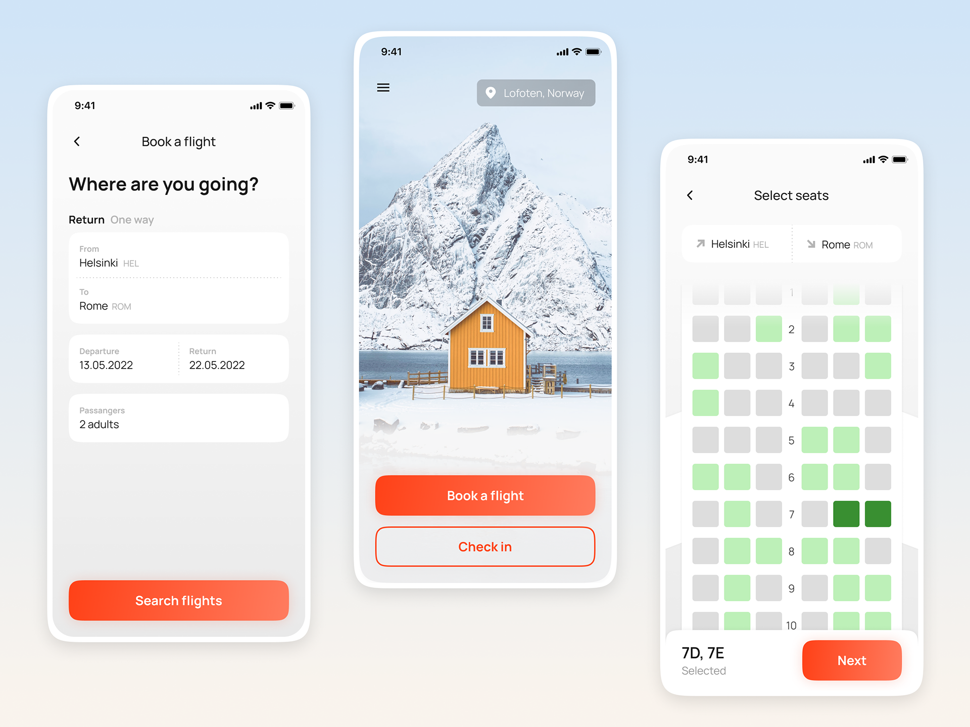
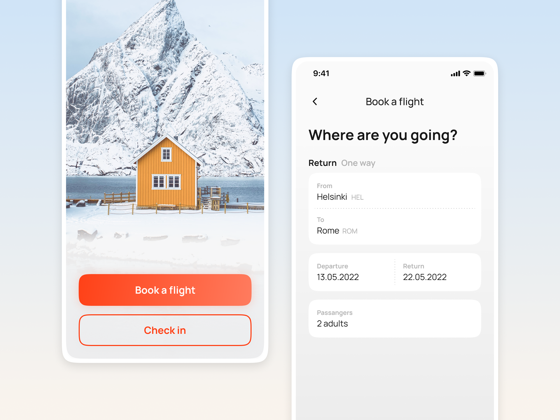
High Fidelity Design
The final task before design was finished was creating high fidelity visuals. They are instantly understandable and relatable to anyone from stakeholders in the project to the end user. These designs are also the main handover and reference for software developers when developing the app.

Conclusion
Completing the FlyUX project as part of the UX Design Certification program was an incredible learning experience. Coming from a Visual Design background I was always drawn to the problem solving aspect of design and was looking for a more informed and objective way to create and evaluating design.
Learning about design thinking and UX design have opened the doors to the world of User-Centered Design for me and enabled me to apply these techniques daily in my work as Product Designer.