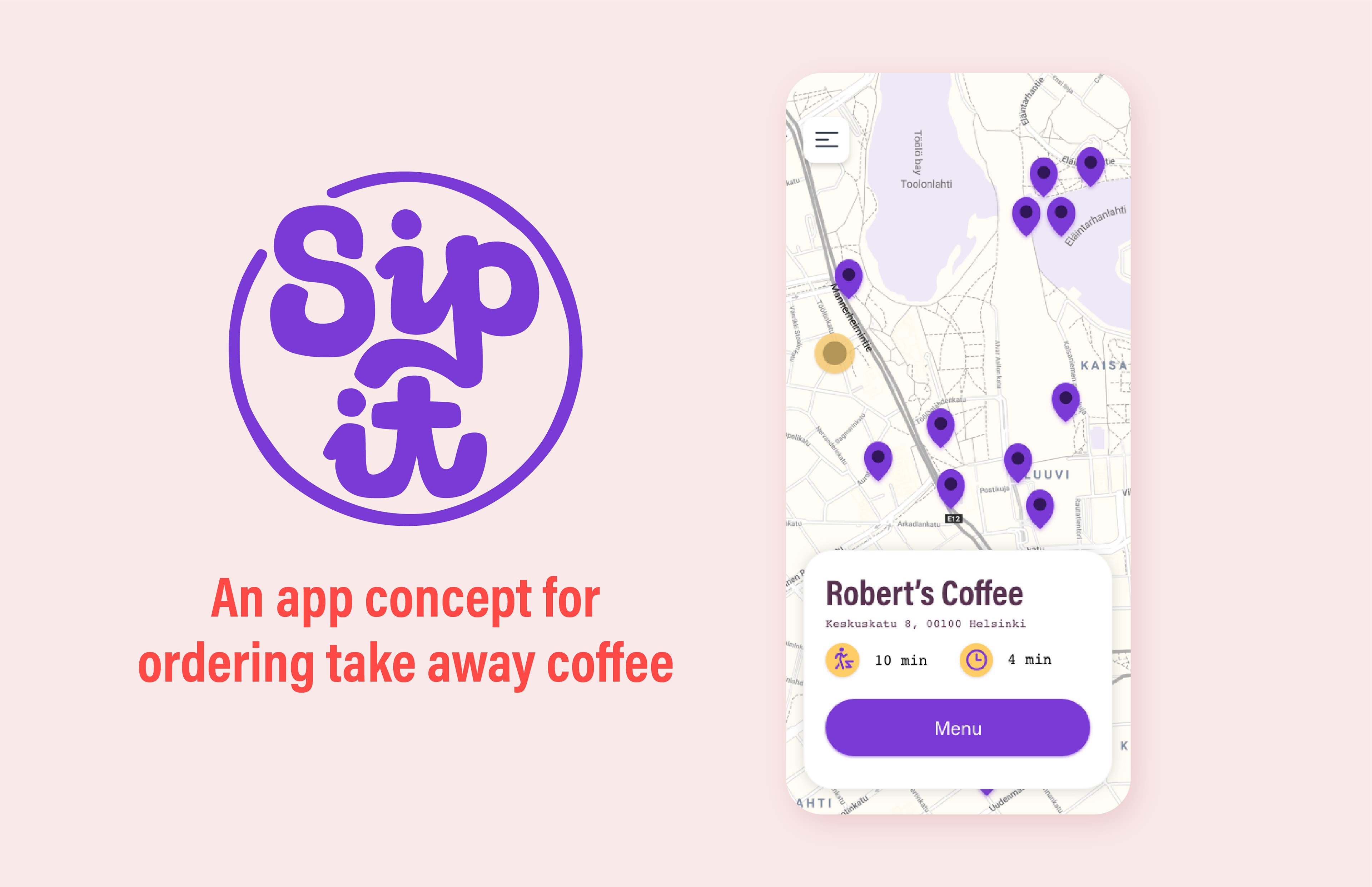
About Sip It
Sip It is an app concept that solves the problem of long queues for those who just need a coffee on the go. Sip It makes it possible to order a coffee or a snack from office or home and grab it on your way to your next destination.
The projects goal was to create an app demo that would follow a user path from starting from log-in and ending at purchase confirmation.
Sip It concept app was a collaborative project with graphic designer Aino Isto. I was responsible for UI and UX design and she was responsible for branding and illustration.

The Problem
Coffee houses are used differently by different people. Sometimes you come for a long conversation with a friend, sometimes to do some work and sometimes you just need a cup of joe on your way and on the go. If only there was a way to skip the cue and have a cup already waiting for you when you arrive!
Big Coffee is already capitalising on this need with coffee ordering apps of their own (also proving such concept can be a success). But what about your favourite local non corporate-giant coffee stop? Will the small guys be left behind once again?
Sip It to The Rescue!
This is where Sip It steps in to save the day - the app is open for all coffee houses. The platform creates a net of coffee places all around the city, you can chose a place in the most convenient location on the map, browse a menu, pick your favourite drink or snack and order it before you step a foot out the door. Don't stand in line, order online!
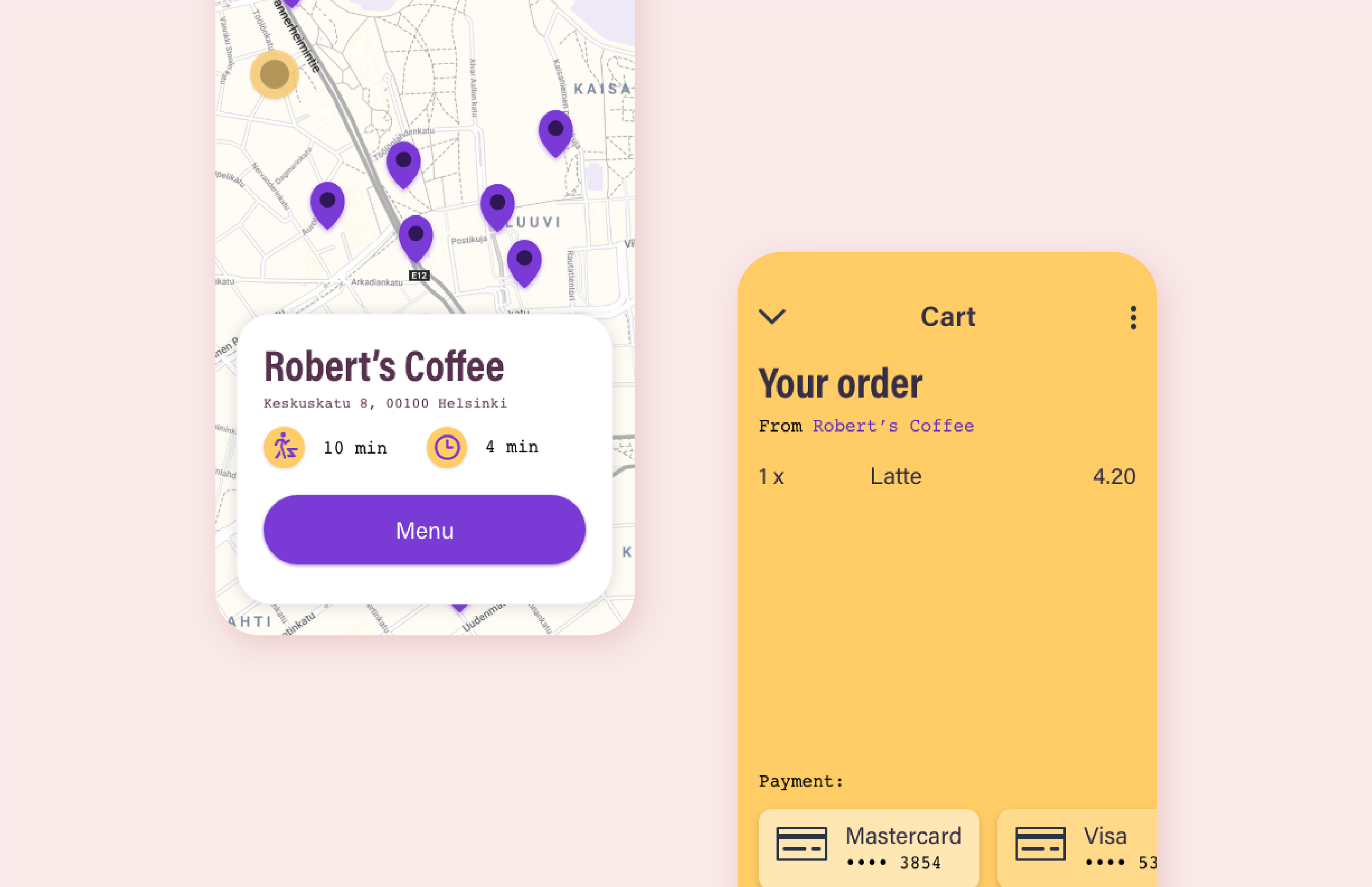
Map screen with location details and shopping cart screen
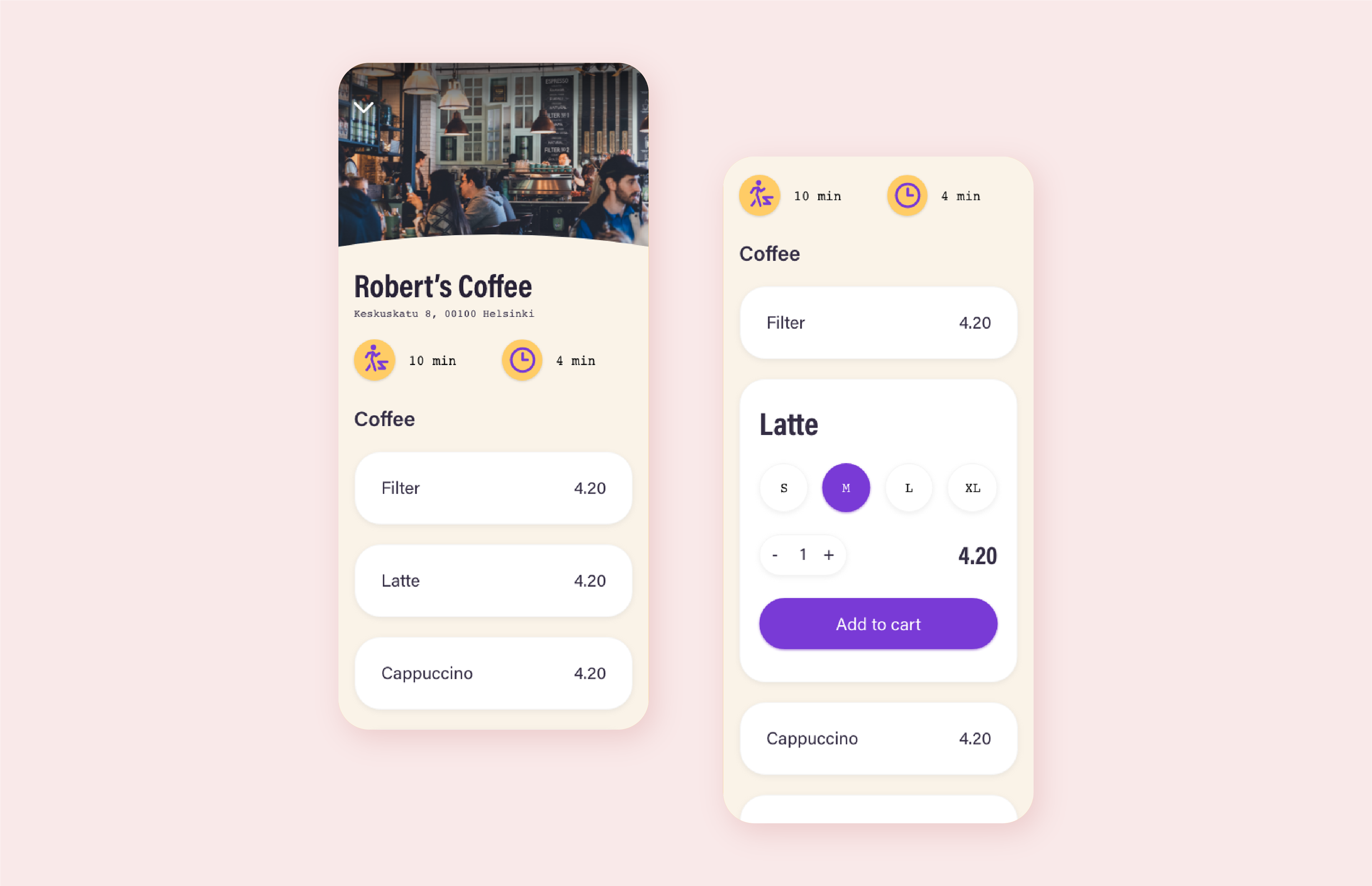
Menu screen upon selecting a place and item detail box
Solution
Sip It differentiates from the abundant offering of order/delivery apps by focusing on two factors - people in a hurry don't want to be overwhelmed with choice and desire speed and simplicity when ordering a cup of the morning brew.
The app follows easy-to-understand UI patters that users feel familiar with and welcome users with quirky, but not over-the-top personality.
This concept follows a typical user flow from log-in to ordering which goes like this:
1. The user is greeted by a map where they can find a spot in a good location and see essential details of a shop by tapping on a pin icon.
2. User taps the Menu button, explores a list of offerings, picks one or more items, chooses details such as size and quantity and adds items to cart.
3. When user is ready to pay they tap the Pay button on the bottom bar. They are then taken to Cart screen where they can review order and payment details.
4. User pays for order by tapping the Pay button and can start their journey to the coffee house.
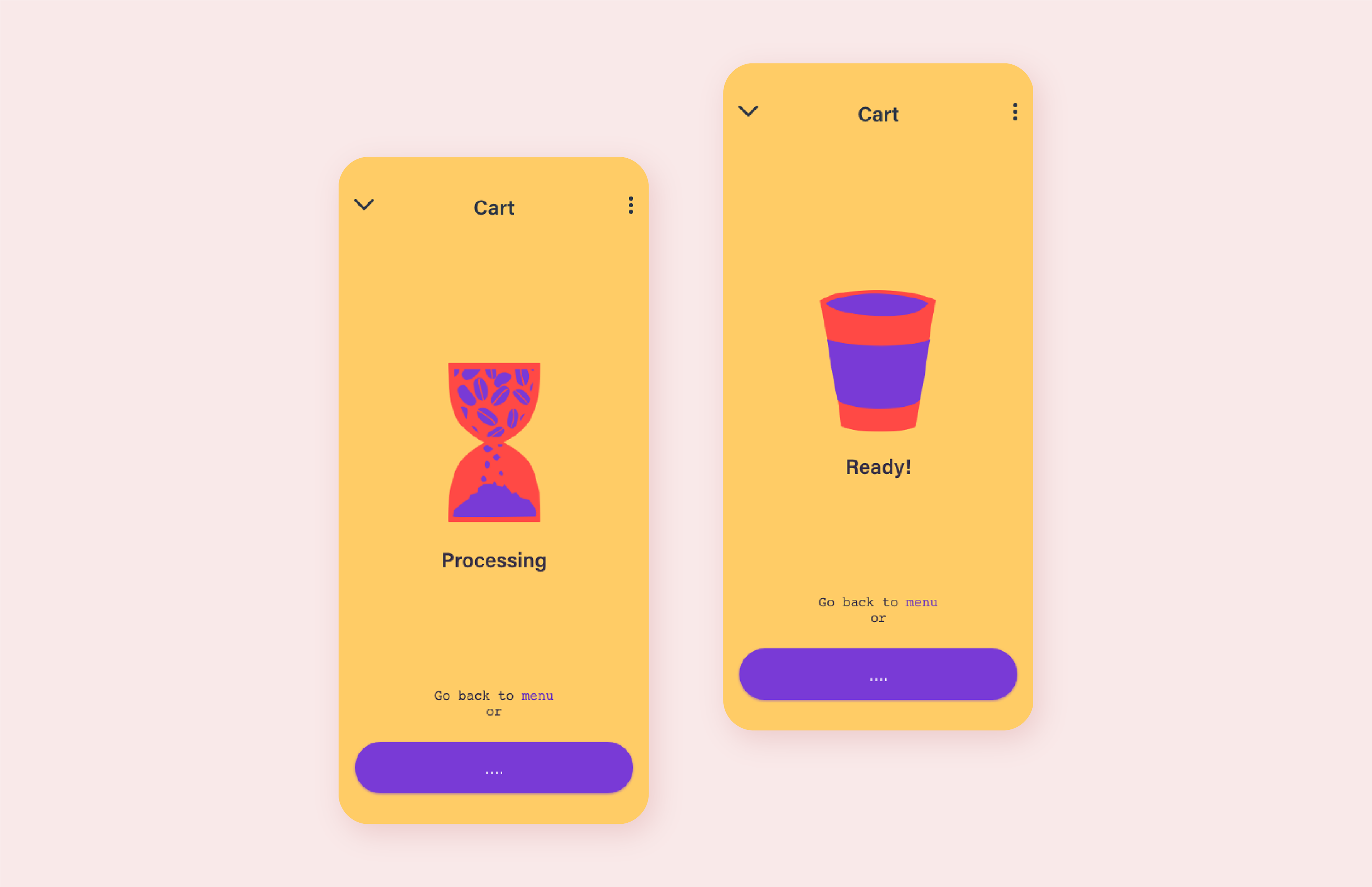
Order processing and order ready screens
What Makes It Special
Sip It offers a fast and fun way to order your favourite drink on the go and online. Easy to use UI and laser-focus on a specific need has something fresh to offer to a groggy demographic.
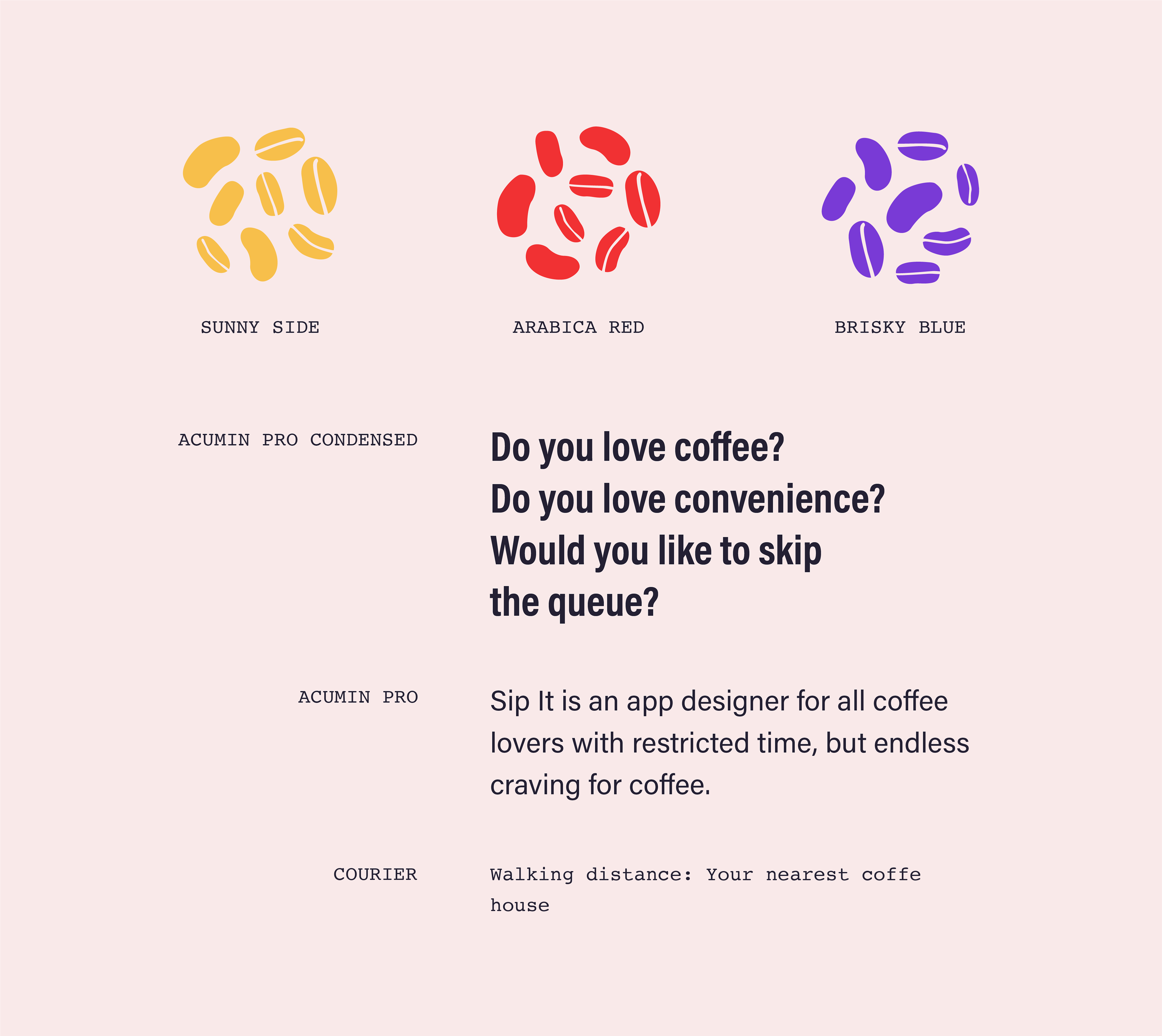
Primary colour palette and typography
Credit
Sip it was a collaborative project and responsibilities were split roughly like this:
UI & UX Design, UI animations - Mykolas Vaitiekunas
Logo, Colors, Typography, Illustration - Aino Isto