Introduction
Token Terminal is a leaderboard and information hub for investors in decentralized finance and crypto finance. Users can find key financial metrics of prevalent companies operating in the industry.
I helped Token Terminal to overhaul and update their web application. The company was in a rapid growth stage and were looking to convert their proof of concept into a world-class financial dashboard. The scope included improving the experience of browsing complex financial information, providing a progressively more detailed journey through the application and identifying the most relevant metrics and tools to the target user.
Business problem
At the start of the project, I worked with the founders of Token Terminal to clarify the business pain points where design improvement would help the most:
1. Website presents overwhelming, unfiltered data upfront thus impeding growth among the amateur investor user group.
2. Informational hierarchy is lacking, not clear which metrics are more important than others.
3. Website visual design and branding gives an impression of amateur project, not a trusted tool for cutting edge technology.
3. Website visual design and branding gives an impression of amateur project, not a trusted tool for cutting edge technology.
The main business targets were:
1. Increasing user engagement, as measured by Monthly Active User rate and Time on Site per session.
2. Increased brand legitimacy and awareness. This could be tracked by positive feedback on social media and other channels.
3. Building a design platform for future growth and iterations. Because I was engaged with the project just for a few months I needed to deliver a complete design that could be iterated on in the future.
The User
Our target user was a professional or semi-professional investor in decentralized finance field. They are tech savvy, interested in emerging technologies and willing to take risks. They are comfortable with using financial dashboards and are hungry for up-to-date and detailed information. Usually the website is accessed through a laptop in home or office enviroment.
They use Token Terminal to find traditional financial metrics on companies operating in decentralized finance field. They can use this information to make investment decisions and track market trends.
Design target
In my design process I focused on achieving 3 goals:
1. Use progressive disclosure to reveal most important information first while keeping the more obscure metrics behind expandable data table rows.
2. Establish a clear visual hierarchy using typography, data visualisation and layout design.
3. Create a consistent and modern UI components that would easily accommodate future growth and improvements.
Outcomes
Token Terminal was focusing on growing their user base and building reputation as a go-to resource for investors in the DeFi industry.
Therefore the key metrics for the team to track were MAU (monthly active users) and other engagement metrics. Here is data gathered during 1 month before and after the redesign:
Monthly active users
Increased from 2.5k in old version to >10k in new version.
Increased from 2.5k in old version to >10k in new version.
Bounce rate
Decreased 8% compared to old version.
Decreased 8% compared to old version.
Time on site
Increased 14% (up to 2 min 40 sec). Time spent on site for Token Terminal is 10% higher compared to competition.
Increased 14% (up to 2 min 40 sec). Time spent on site for Token Terminal is 10% higher compared to competition.
Old website
Website before the redesign
Wireframes and design iterations
Early wireframes
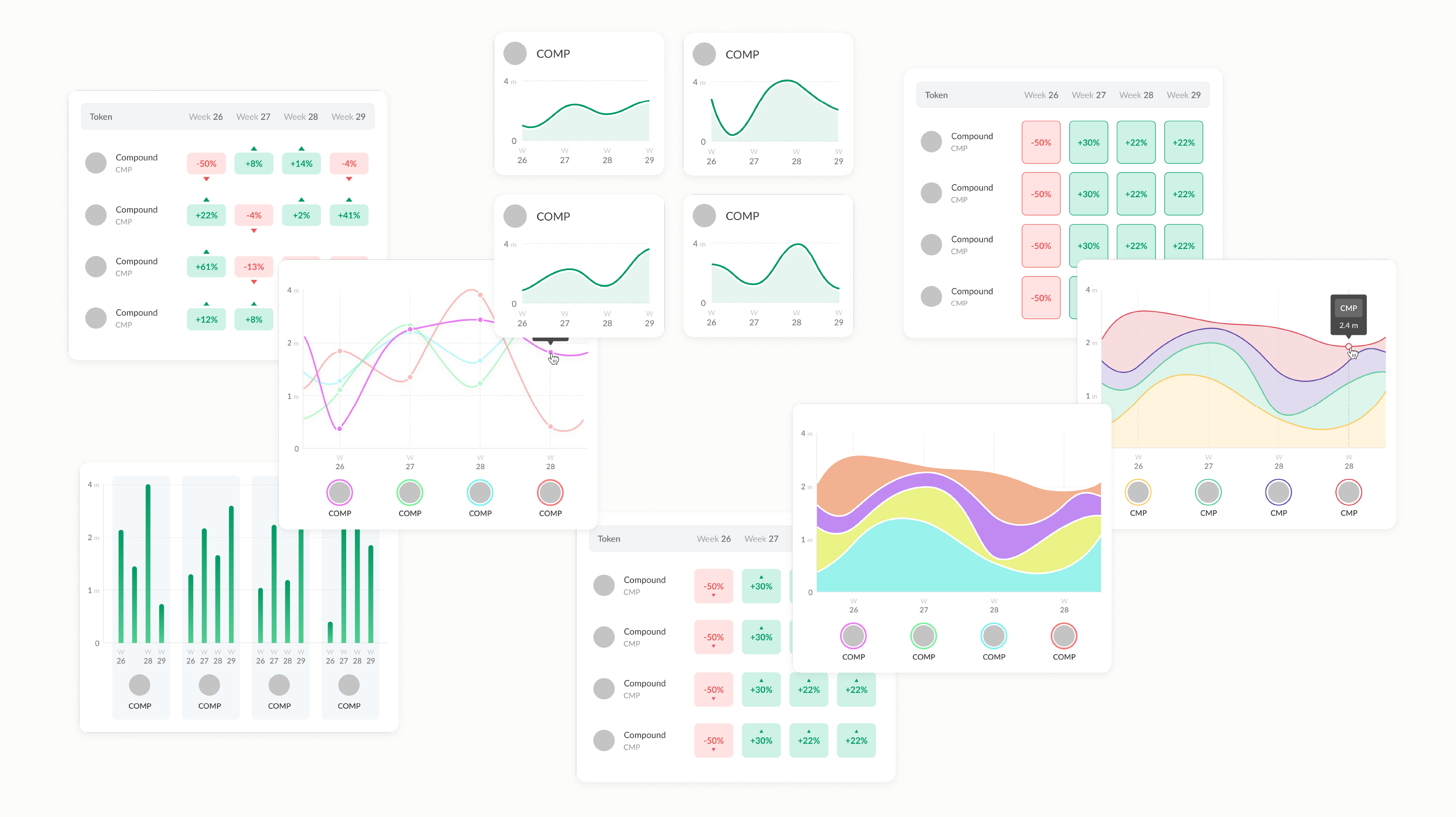
Graph and chart iterations
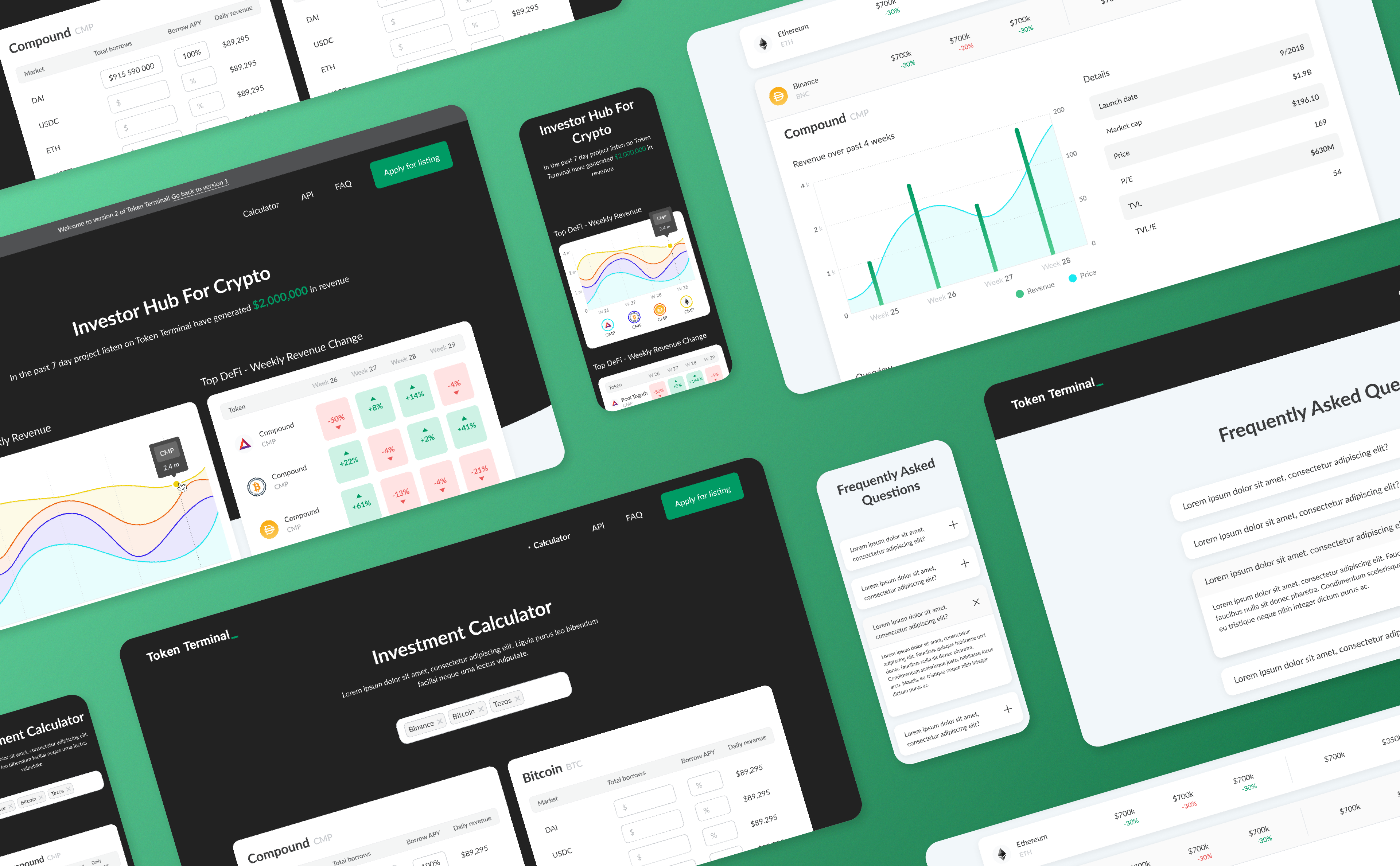
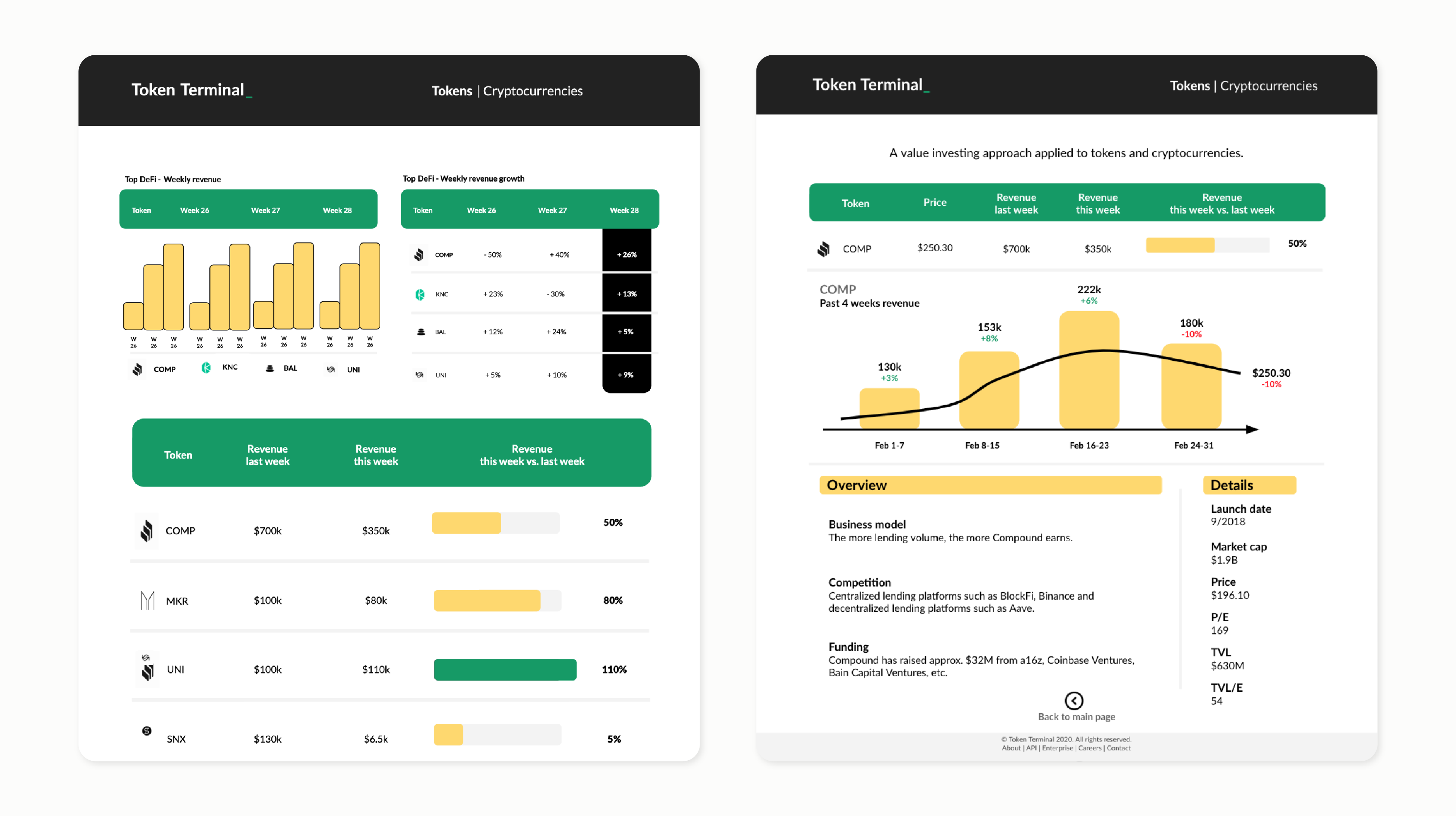
Final design and improvements
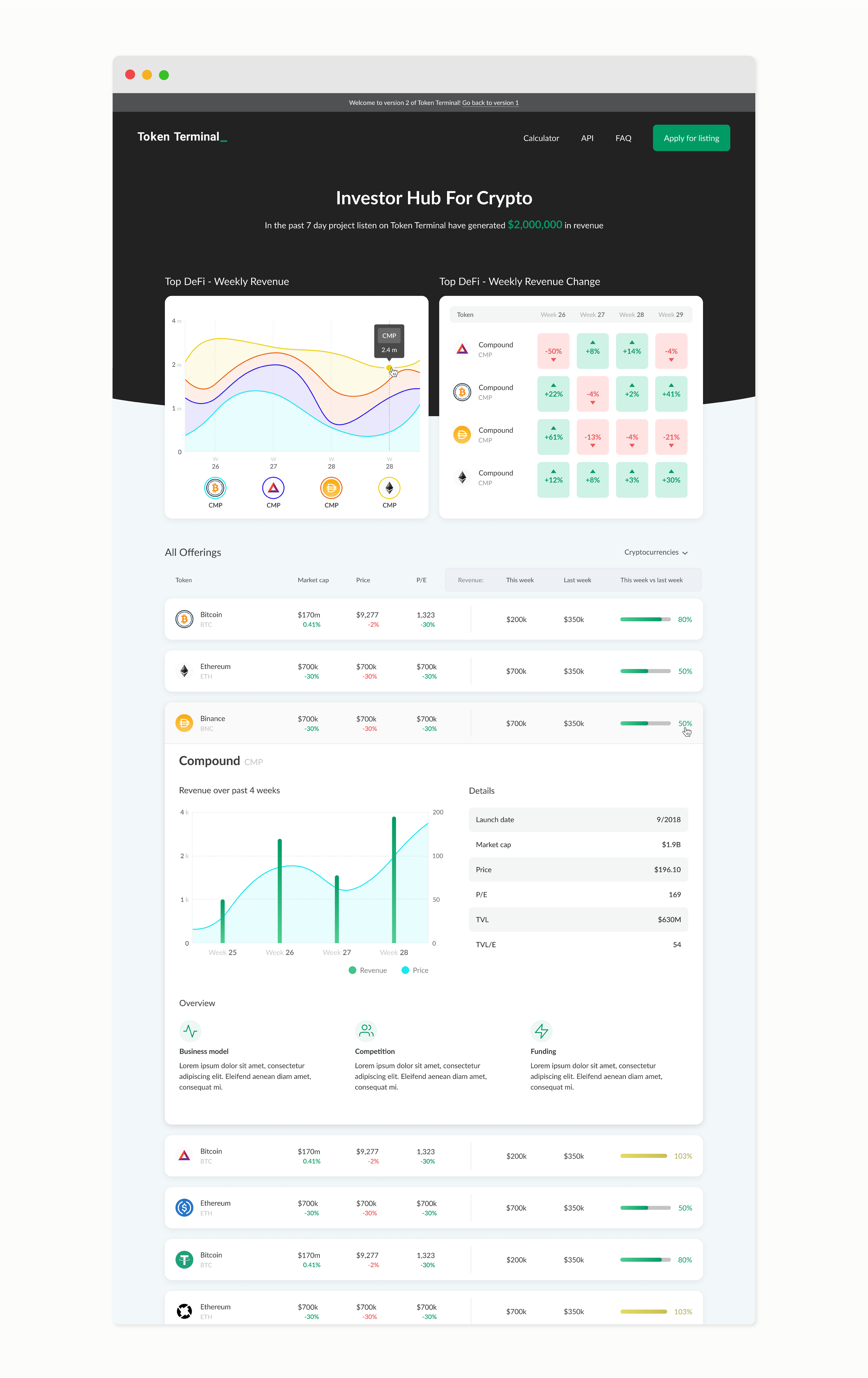
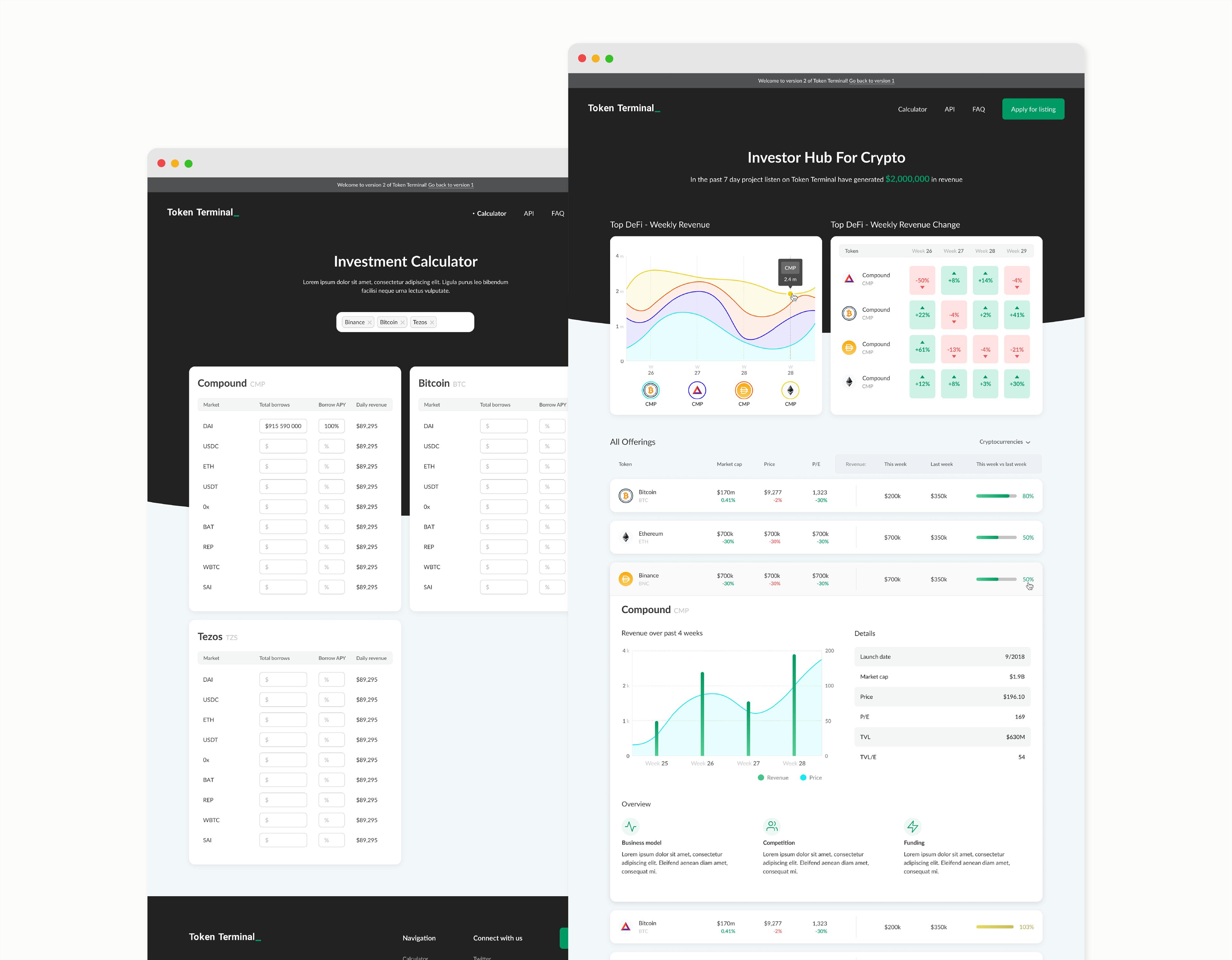
Main Section - Top companies and metrics
According to interviews and feedback from the users, the new design improves the top charts (the 2 charts that are seen upon opening the page) by changing the information shown, clarifying the copywriting by using less specialized terms and presenting the information in a more glanceable format. For the user, these improvements translates to seeing more relevant information and being able to comprehend it more quickly.
Top DeFi company leaderboards
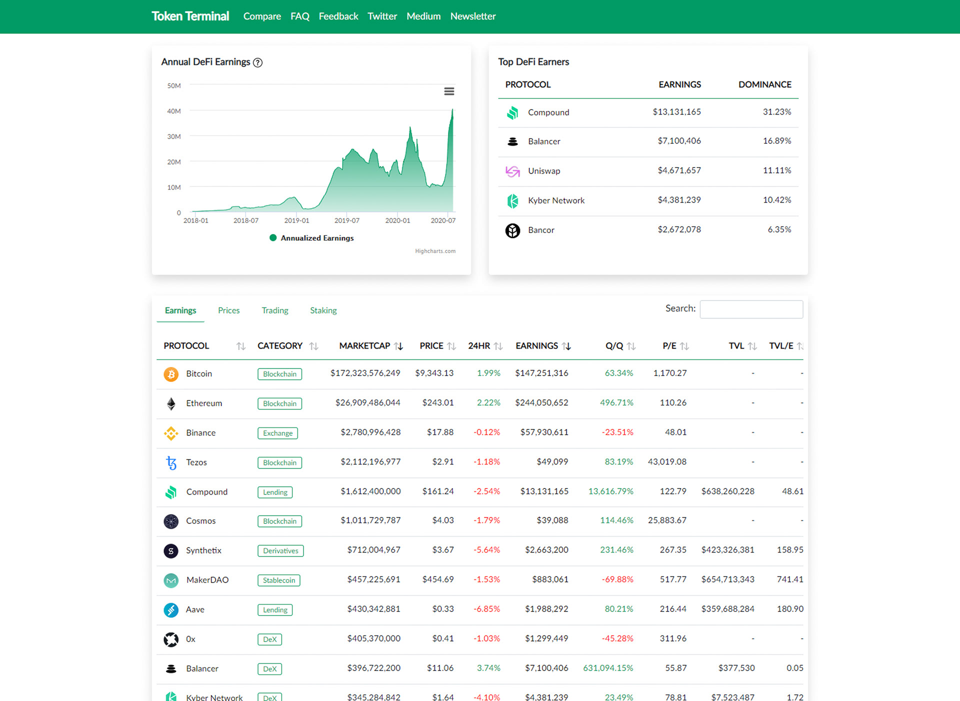
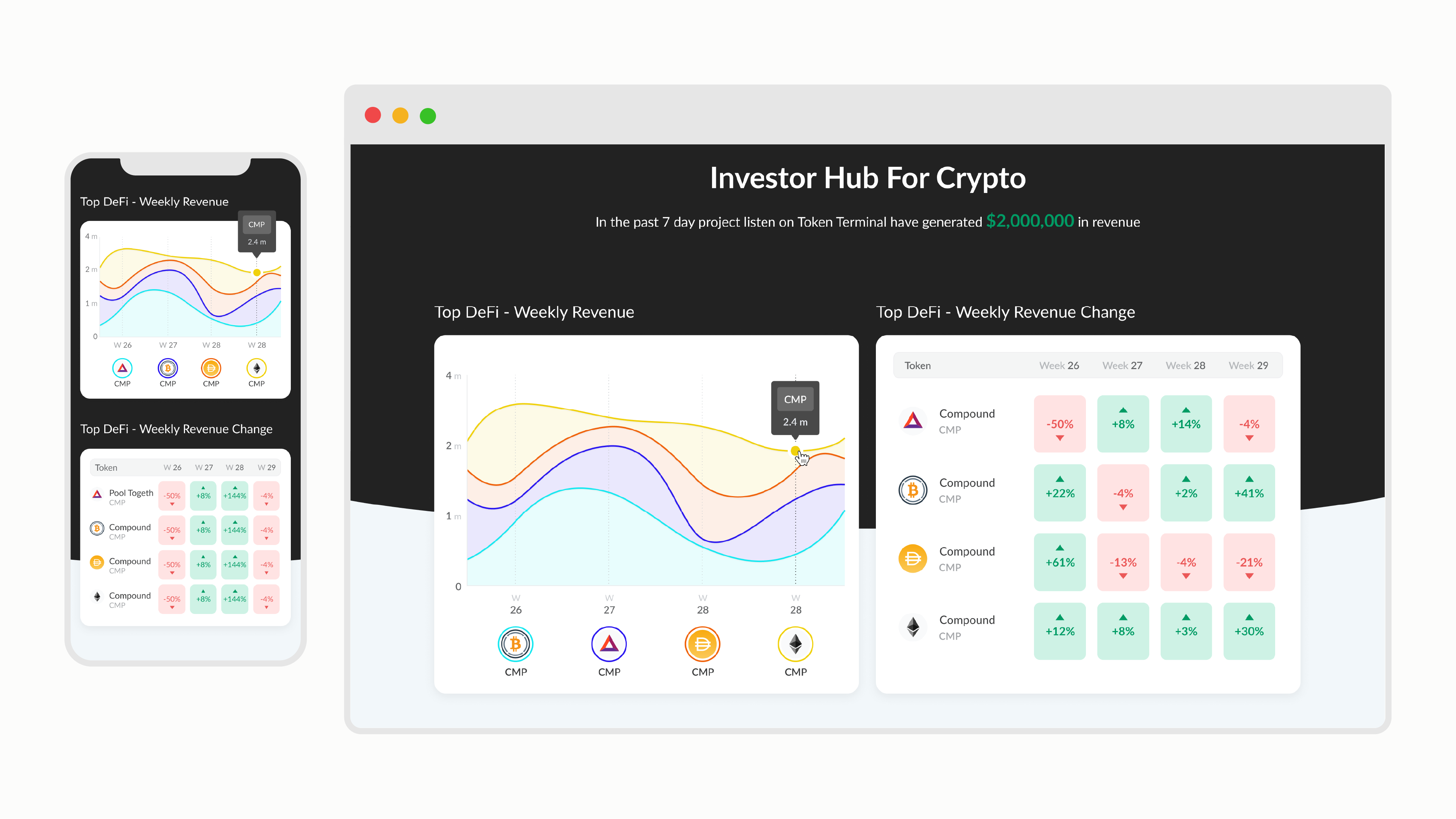
Listing view
After scrolling bellow the top charts user, can see the listing view of all companies. In this view the new design made several key improvements to the experience:
1. Reducing and consolidating metrics to allow user to scan information more easily.
2. Showing the " this week vs previous week" metric as a visual health bar thus making the information more scannable.
3. User can expand each row to see more information about the company without leaving the page therefore not losing the context.
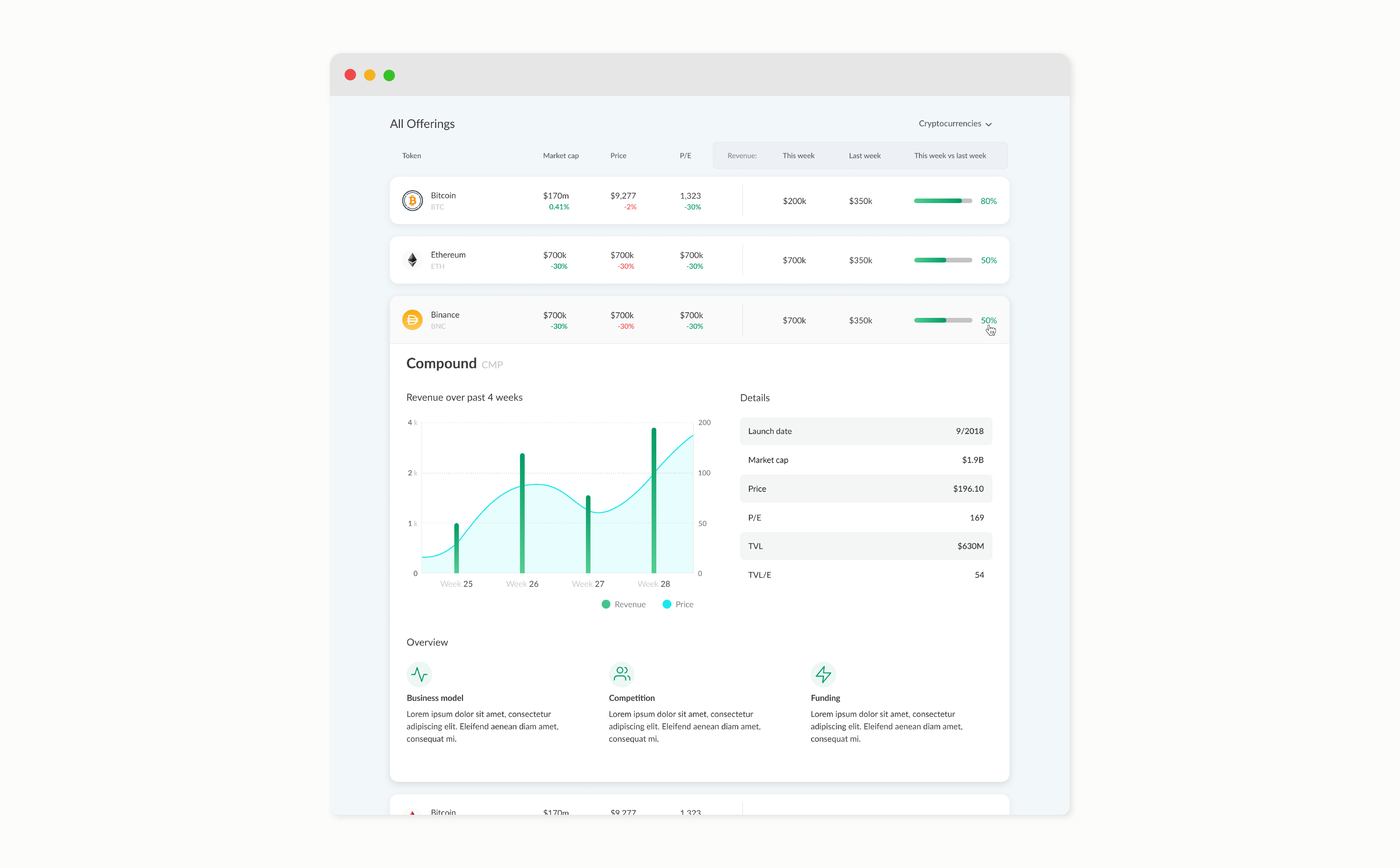
Mobile friendly design
The data table is split into 2 sections in mobile view - revenue is shown on left and Market cap is shown on right
Learnings
This was an eye opening project for me as a designer. I got to learn about Financial, Decentralized Finance and Cryptocurrency industries and got to be a part of a rapid and agile project. My main takeaways from this project are:
- I learned how to design complicated financial charts and dashboards.
- When designing financial software knowing your target audience is key. Experienced investors have very different requirements from amateurs.
- As a designer, not knowing the market or the industry you're working in is okay, that's why it's so important to conduct research. Then you can base your design decisions on data.
- In the chaotic startup environment it's easy to lose track of the proper product design process. It's my job to know the value of each step, be able to pick and choose best techniques when under resource and time pressure and to be able to communicate my decisions to my team.