Introduction
Oyama provides a personalised, evidence-based psychotherapy app that help users understand themselves better and tackle daily challenges.
I helped Oyama to redesign their website, which is an essential part of their online marketing toolbox.
Business Case
When I joined the project the company was pivoting from providing a web based application meant for high school students to creating a mobile app that would serve a broader user base, but would still focus on providing an online space where users could anonymously share and support one another in a safe environment. The company wanted to build a new website that would help promote the product and the company itself.
The main business objective of the website was to have a place where Oyama product and company could be presented to potential investors, partners and recruits in a fully branded format.
Users
The first group of the website users was beta testers and early adopters of the mobile app. These users were often reached directly, word of mouth or social media channels and were invited to test the product and help the team by giving feedback. In general they were
- In their twenties to early thirties
- Working in big cities
- Familiar with many digital products and apps
- Weary of social media
- Interested in improving their mental well-being
- Curious about tech products that could help improve mental well-being
The second group could be called future friends and partners. This group contains potential investors, media and those interested in working with the company. The common traits of people in this group are:
- Professionals or students in technology sector
- Looking for broad information about the company and the product
Process
My task was to design a new website that would become the face of the company to potential users, investors and the general public.
I started by taking best learnings from a previous website, analysing brand identity, product vision, performed market research and competitor analysis. Then I created a map for the content structure of the new website.
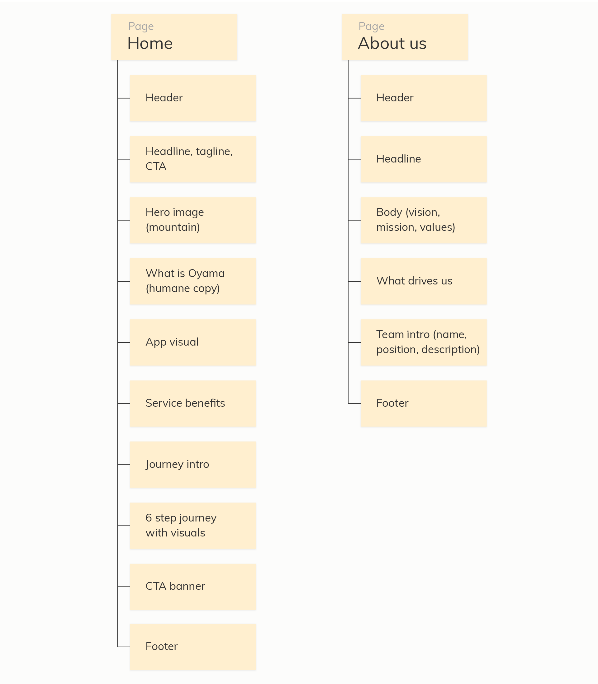
Wireframing
The next step was to sketch out low fidelity wireframes and in collaboration with the team find the website structure for the upcoming content.

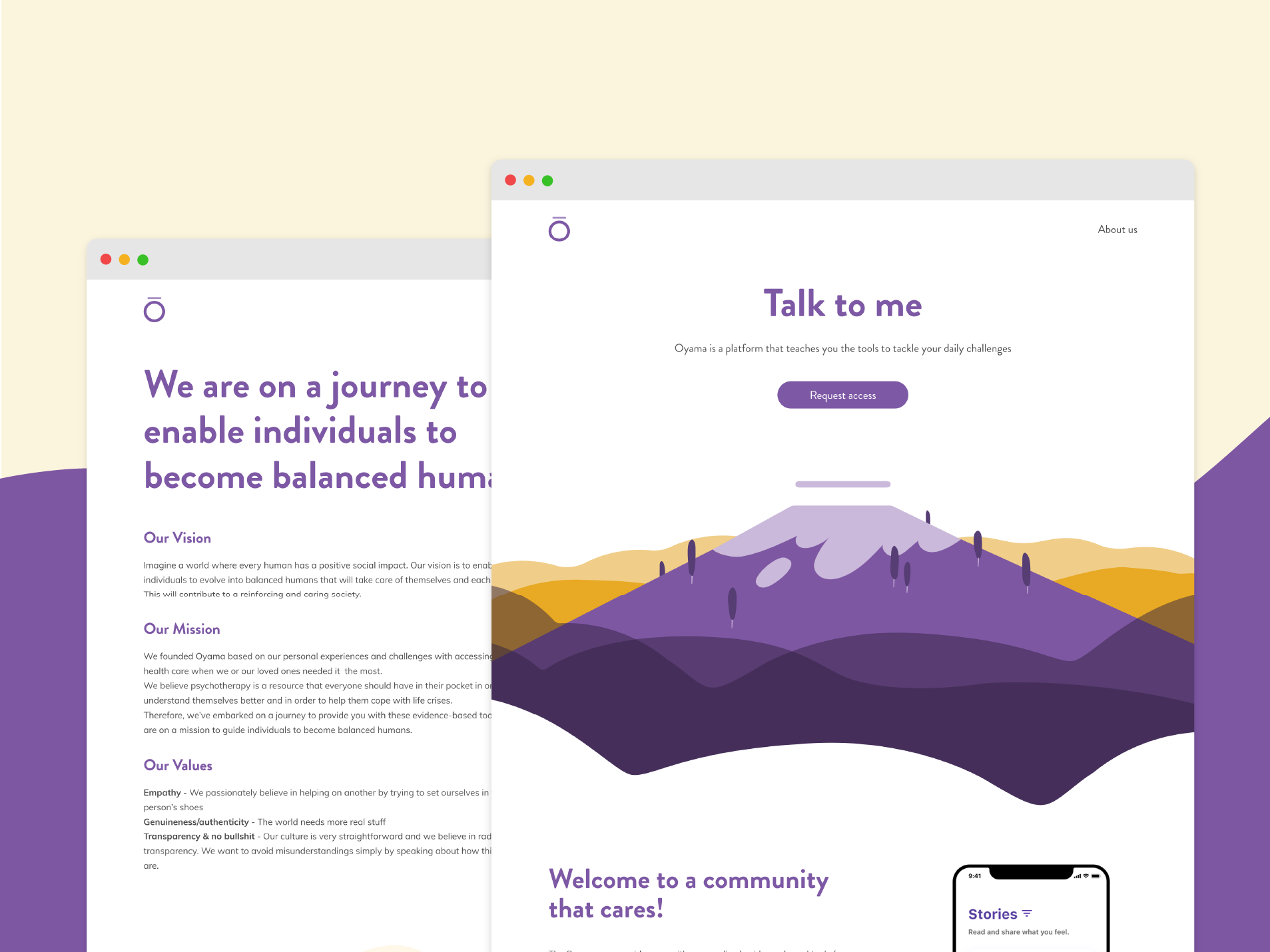
Visual design
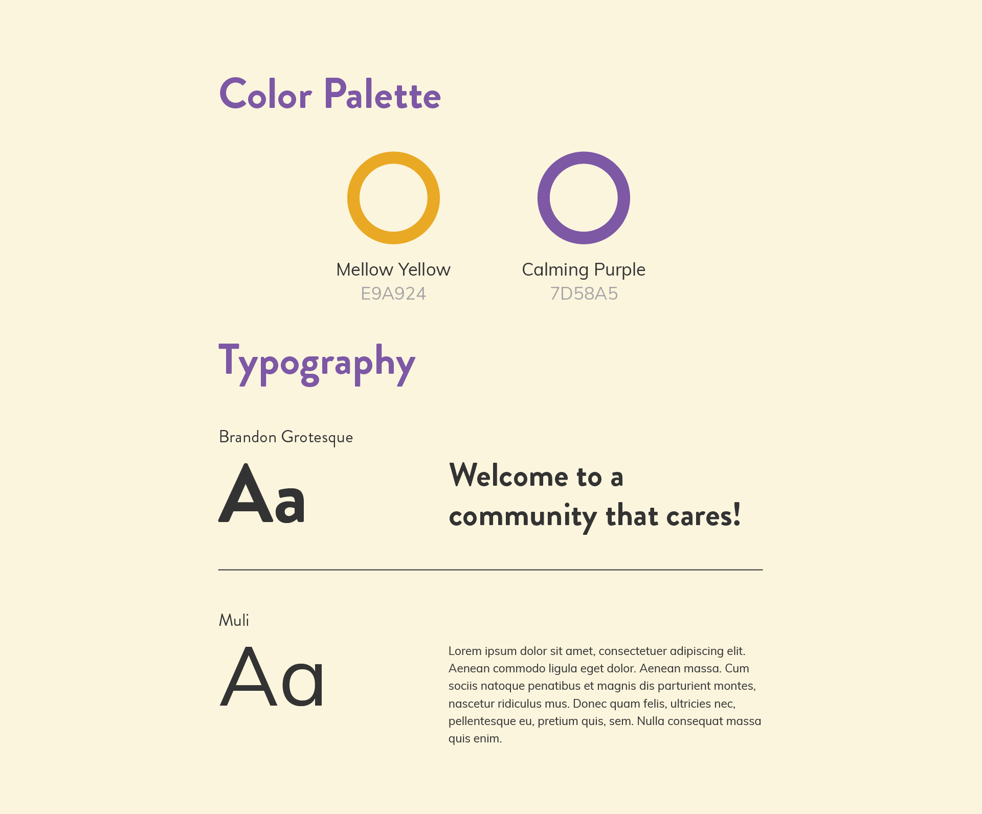
Alongside website design companies brand was also refreshed. In collaboration with a graphic designer illustrations were created to accompany the layouts, work began on finding fonts and a color pallet.
Iteration and testing
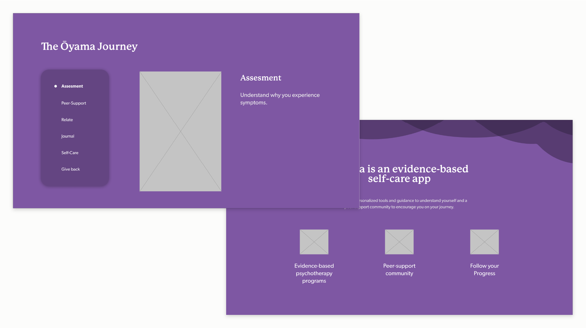
While working on UI and visual design we came to several dead ends in the website layout - the chosen way to display the JOURNEY section was not satisfying and needlessly compressed this important section of the website. Moreover the initial decision to go with a purple background proved to be too strong and contrasting.
At the same time I tested many different typeface combinations. The brand was supposed to bring warmth and friendliness to a tech product, but at the same time still maintain a clean modern aesthetic so finding the perfect typography, illustration and color combination was key.
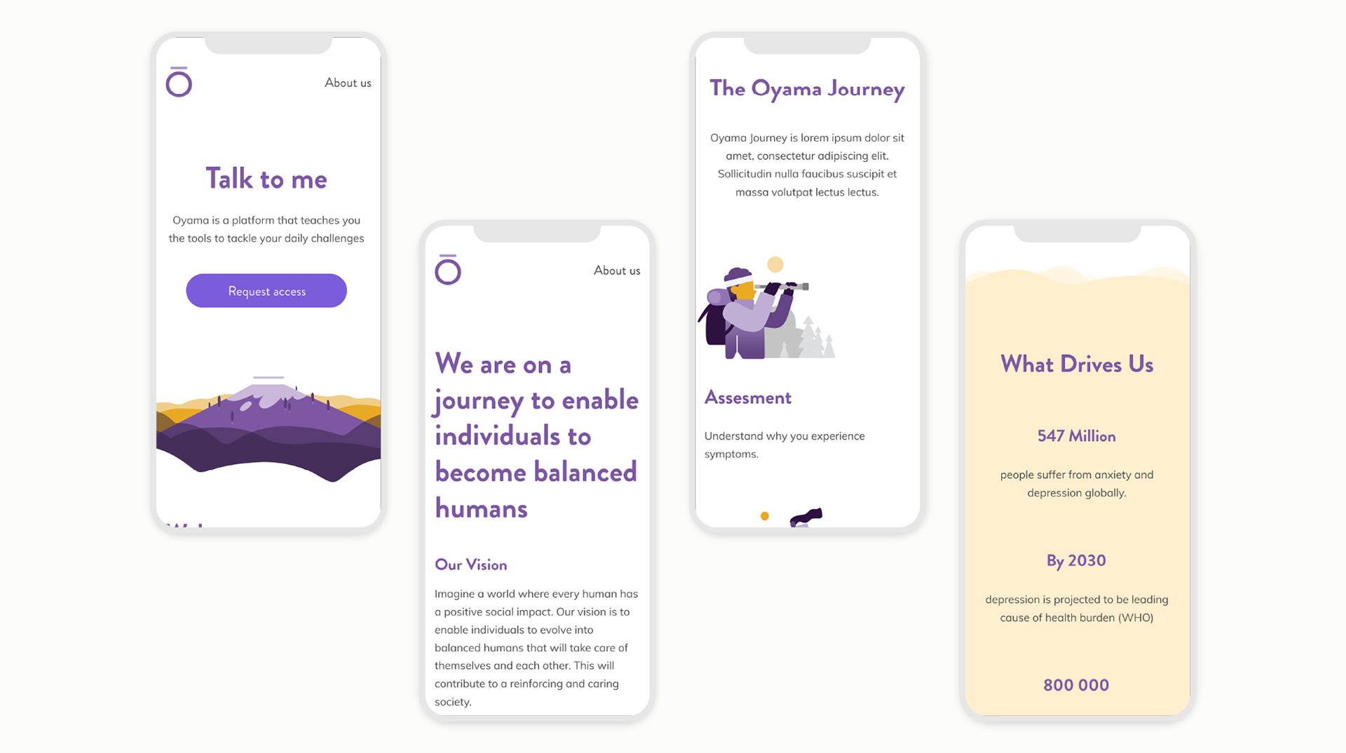
Final layouts
When we found a satisfying mix of visual elements I finalised the visual layouts and proceeded to recreate the website in Wordpress.

Responsive
We made sure that the website would be fully responsive and work in any resolution.
Learnings
This project was a great experience to refresh my technical skills and to work throughout a web development project. I handled the process starting from sketches on paper down to implementing UI effects and connecting external API's to form fields. Here are the key takeaways:
- In a more marketing and promotion oriented project such as this storytelling is key. From a UX designers perspective it means making sure that the content structure makes sense to an outside visitor and that the website ensures a smooth flow to the key action.
- Implementing changes in the development stage is even harder (or less efficient) than it looks.
- Communication between members in the design team is very important and keeping everyone on the same page and aligned in a remote team is a challenge.